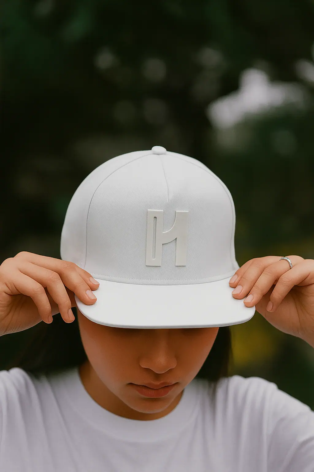
Let me tell you how I came up with my Human01d logo. I was sitting there with a blank sheet of paper, staring at it for what felt like forever, trying to figure out a mark that truly felt like Human01d.
I was aiming for a clean, simple, standalone mark something in the league of Apple’s apple, Facebook’s f, Instagram’s camera, or TikTok’s note. A shape that’s instantly recognizable at any size and holds its identity whether it’s a favicon, an app icon, or a hero graphic.
So I grabbed a pencil and started messing around. First I drew a big H.
I leaned back and let my eyes rest on the page. No spark. No direction. Just a stubborn letter staring back at me.
We’ve all been there, right? That moment when you know there’s gold in an idea, but it’s hiding and you’re just poking at it like “come on, show yourself!”
My brain’s racing: “Human01d… it’s gotta be in this H somehow.”
I start tracing over it lightly, testing curves on the left bar, straightening the right one harder. I’m muttering to myself, erasing little bits, redrawing, total mad scientist vibe.
It’s frustrating as hell, but also kinda addictive, because every tiny tweak feels like I’m getting closer to that “aha” moment.
And honestly, that messy back-and-forth? That’s the real magic. No fancy tools yet, just me, a pencil, and pure stubborn creativity refusing to quit until the H finally started whispering its secret back to me.
I kept asking myself, “How do I make this H feel alive? How do I sneak in that digital soul without it looking forced?”
Then it hit me hard: What if the legs of the H were actually a zero and a one? The left as the zero, the right as the one.
That idea alone made my heart jump.
I started breaking the H down piece by piece.
The left leg came first. I kept it straight and solid, but I carved a hollow inside it, not a circle, not a curve, just a clean inner cut that hints at a zero.
It still stands upright like a normal stroke, but that opening gives it a zero‑shaped impression without bending the form.
Then I moved to the right leg. I drew it tall and clean, the way a number one stands. No bending, no tricks, just a strong vertical line.
And once both legs were there, I added the top bar. The moment that stroke connected them, everything clicked.
The crossbar at the top bridged the zero on the left and the one on the right perfectly, locking it all into one seamless H.
It was rough, the lines were shaky from how fast I was sketching, but dude… I could already feel it. That moment when an idea finally breaks through hits different.
Anyone who’s ever battled a blank page knows exactly what I mean.
It wasn’t perfect right away. My hand sketch looked kinda wobbly, like a kid’s drawing, but I could see the potential. I snapped a pic and fed it into Copilot to clean it up: sharpen the lines, make it sleek and modern.
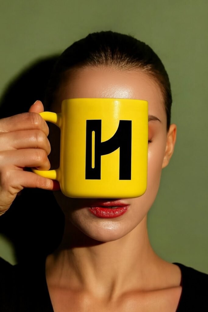
When the final version popped up on my screen, man, my heart skipped a beat. There it was: an H at first glance, solid and bold. But zoom in, and boom, the 01 reveals itself, hiding in plain sight.
It’s there the whole time, just waiting to be seen.
The whole idea in one shape.
Human on the outside, machine in the details.
I got this huge rush of excitement, like everything I’d been dreaming about for this brand just clicked into place. Goosebumps, seriously.
Now, every time I look at it, I’m pumped. It’s wild seeing an idea that lived in my head finally take shape. And owning human01d.com? That’s the perfect finishing touch.
I can’t wait to slap this on everything and watch the brand come alive. It’s gonna be wild.